01
The Challenge
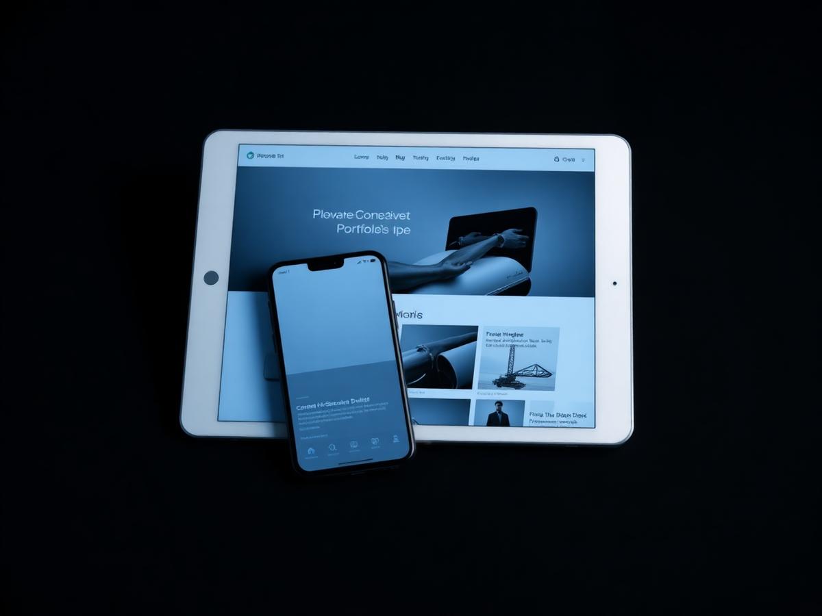
A serious B2B offering was buried under stock imagery and vague copy, leaving prospects unclear about what the company actually does.
02
The Approach
We led with clarity: a strict content hierarchy, one idea per section, and a page system that can grow with new services without redesign.
03
The Design
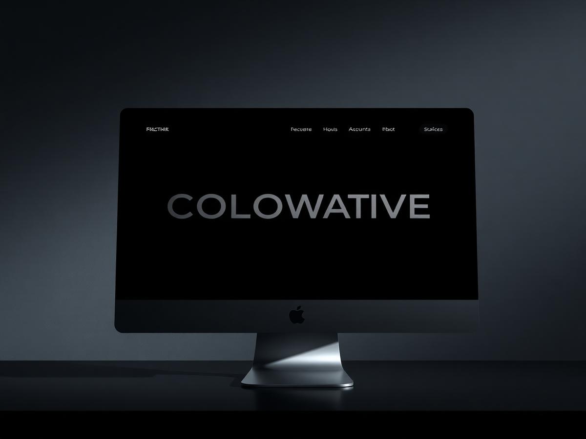
A typographic system doing the heavy lifting — precise spacing, hairline rules, a single accent, and almost no decoration.
04
The Experience
Short paths to the pages that matter, readable long-form sections, and contact reachable from anywhere on the site.
05
The Result
A corporate presence that reads as credible and current, with a reusable page system the team can extend as the offering grows.
Gallery
Next projects
Start a project